Marginwell
SaaS Platform

Project Type
Concept Study
Industry
Media
Services
SaaS Product Design & Development

Overview

Marginwell explores how editors, designers and image researchers can work around the publication itself. The page spread is the primary workspace, with tools arranged around the content rather than a dashboard of business metrics. Four views cover designing a spread, sequencing an issue, reviewing a proof and finding the right asset. The visual system combines a pale tool rail, a spacious pasteboard, contextual inspectors and a bright selection color so the work remains the focal point.

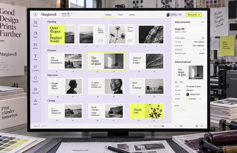
Marginwell SaaS Platform hero

Original publishing interface concepts with illustrative editorial content, assets and review notes.

Challenge

Publishing teams move between page layouts, asset folders and feedback threads. A comment can lose its connection to a particular page or version, while a list of filenames says little about how an image will support the story. The design challenge is to preserve visual context as an issue moves from planning through review.

  • Review notes need to identify both a position on the page and the version being discussed.
  • Editors need to see the rhythm of an entire issue alongside individual spreads.
  • Asset selection depends on visual composition as well as credit and usage context.
  • Creative tools need to provide detailed controls without shrinking the publication canvas.

Solution

The proposed workspace uses four deliberately different layouts that share a compact tool rail and top menu. The spread editor centers a two-page composition with an inspector beside it. The flatplan presents the issue as visual page thumbnails. Proof review places annotation threads next to the affected spread, and the asset library uses a contact sheet with metadata for the selected image. Each layout follows the task rather than repeating a dashboard template.

  • A page-first editor keeps the publication large and directly visible.
  • The flatplan shows sequencing through spread thumbnails and section groupings.
  • Pinned comments preserve the location of feedback within a proof.
  • An image-first library pairs visual browsing with credit and usage metadata.
  • Contextual controls appear beside the selected content, supported by eight compact tool destinations.

Results

  • 4

    Distinct
    editorial views

  • 8

    Tool-rail
    destinations

Let’s CraftingVisual ImpactStart a Project

We Are Available For New Project

Marginwell
SaaS Platform

Project Type
Concept Study
Industry
Media
Services
SaaS Product Design & Development

Overview

Marginwell explores how editors, designers and image researchers can work around the publication itself. The page spread is the primary workspace, with tools arranged around the content rather than a dashboard of business metrics. Four views cover designing a spread, sequencing an issue, reviewing a proof and finding the right asset. The visual system combines a pale tool rail, a spacious pasteboard, contextual inspectors and a bright selection color so the work remains the focal point.
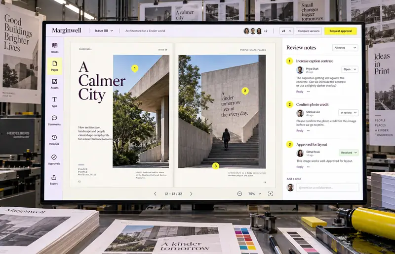
Marginwell SaaS Platform — hero

Original publishing interface concepts with illustrative editorial content, assets and review notes.

Challenge

Publishing teams move between page layouts, asset folders and feedback threads. A comment can lose its connection to a particular page or version, while a list of filenames says little about how an image will support the story. The design challenge is to preserve visual context as an issue moves from planning through review.

  • Review notes need to identify both a position on the page and the version being discussed.
  • Editors need to see the rhythm of an entire issue alongside individual spreads.
  • Asset selection depends on visual composition as well as credit and usage context.
  • Creative tools need to provide detailed controls without shrinking the publication canvas.

Solution

The proposed workspace uses four deliberately different layouts that share a compact tool rail and top menu. The spread editor centers a two-page composition with an inspector beside it. The flatplan presents the issue as visual page thumbnails. Proof review places annotation threads next to the affected spread, and the asset library uses a contact sheet with metadata for the selected image. Each layout follows the task rather than repeating a dashboard template.

  • A page-first editor keeps the publication large and directly visible.
  • The flatplan shows sequencing through spread thumbnails and section groupings.
  • Pinned comments preserve the location of feedback within a proof.
  • An image-first library pairs visual browsing with credit and usage metadata.
  • Contextual controls appear beside the selected content, supported by eight compact tool destinations.

Results

  • 4

    Distinct editorial views

  • 8

    Tool-rail destinations

Let’s Crafting

Visual Impact

Start a Project